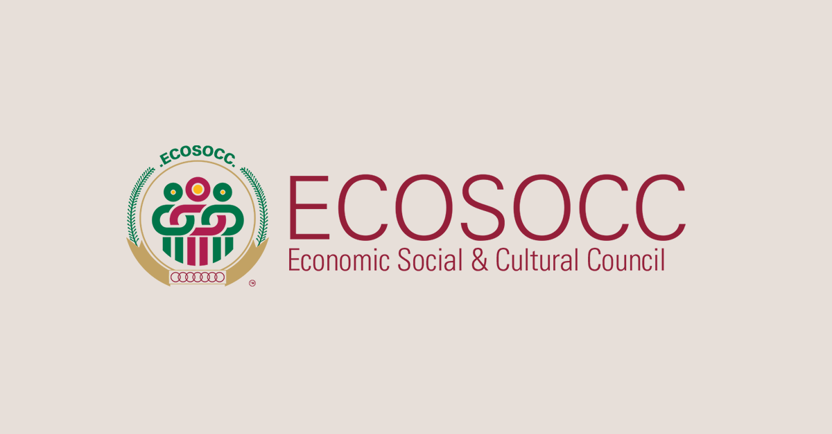
The Economic Social and Cultural Council (ECOSOCC) yesterday launched its updated brand identity, which includes a new logo, colours, font and website as part of the African Union’s rebranding of Organs and Agencies.
After careful consideration, with the support of the African Union Commission’s (AUC) Information and Communication Department, ECOSOCC chose new brand elements that reflect a more modern look and capture its mission to deliver on its mandate.
Launching the new brand, His Excellency Diaby Moustapha Mamy, Senior Adviser, ICT and Digital Transformation in the office of the AUC Deputy Chairperson, reiterated the importance of branding for an AU Organ like ECOSOCC.
“It is important to do things well, but it is also essential to let people know what you’re doing well. Especially when you act in the name and on behalf of populations and communities through established institutions,” he said.
He emphasized the value of visual and dynamic elements in social media and websites; and how important branding is, in online spaces.
Mr. Patson Malisa, Deputy Presiding Officer of ECOSOCC, provided some insight on the evolution of ECOSOCC’s branding elements, particularly the logo. The new logo, like the former, draws its inspiration from the African Union (AU) logo as it is similar in shape and graphical representation. Elements like the palm leaves (standing for peace), the gold circle (symbolizing Africa’s wealth and bright future) and interlocking red rings (signifying African solidarity and the blood shed for Africa’s liberation) still remain within ECOSOCC’s new logo.
William Carew, Head of the ECOSOCC Secretariat said “Our new brand is an important step in our journey and represents the integrated way in which we will work to achieve our mandate and shared ambition to transform the African Continent and indeed be the voice of the African citizens to achieving “The Africa We Want.” The new brand symbolizes who we are today and our hope for our future.”
“Our name remains the same but our logo and website have changed to more accurately reflect ECOSOCC’s identity today and hopes for the future. We hope you will find our new brand exciting and the new website refreshing, easy to navigate, and a one-stop-shop for all your CSO information needs,” he said.
The new ECOSOCC logo, while building upon the previous one, includes some new elements like the green and red interlocking people to represent a united and interlinked people of Africa with its cultural diversity, richness and immense capability of the continent. The interlocked people further highlight the people-centred nature of the AU and the new dynamism and renewed hopes of the African citizenry to drive its development agenda forward.
Mme Wynne Musabayana, Head of Communication Division, AUC ICD, stressed the importance of branding within the AUC, and the AU as whole.
“ECOSOCC is a very important Organ of the African Union. It is the Organ that helps us to link up with the citizens of the continent. And as such, in terms of branding and promoting the identity of the African Union to the outside world, we could say that ECOSOCC is at the forefront of that effort; we are very happy that we have been able to support this rebranding of ECOSOCC,” she said.
There was a visual presentation of the new look, and feel, of the new brand. The two shades of AU green represent renewal, harmony, growth and environment; while gold represents Africa’s wealth and prosperity; grey represents diplomacy; and white represents peace.
ECOSOCC’s new tagline captures, in a short statement, what its core mandate/vision is: The Voice of the African Citizenry.
The website has migrated from auecosocc.org to ecosocc.au.int. The new website features easy-to-navigate pages and is more interactive. The visual design showcases and celebrates all that ECOSOCC does towards achieving its mandate while the layout is designed to provide a seamless user experience